Craigslist
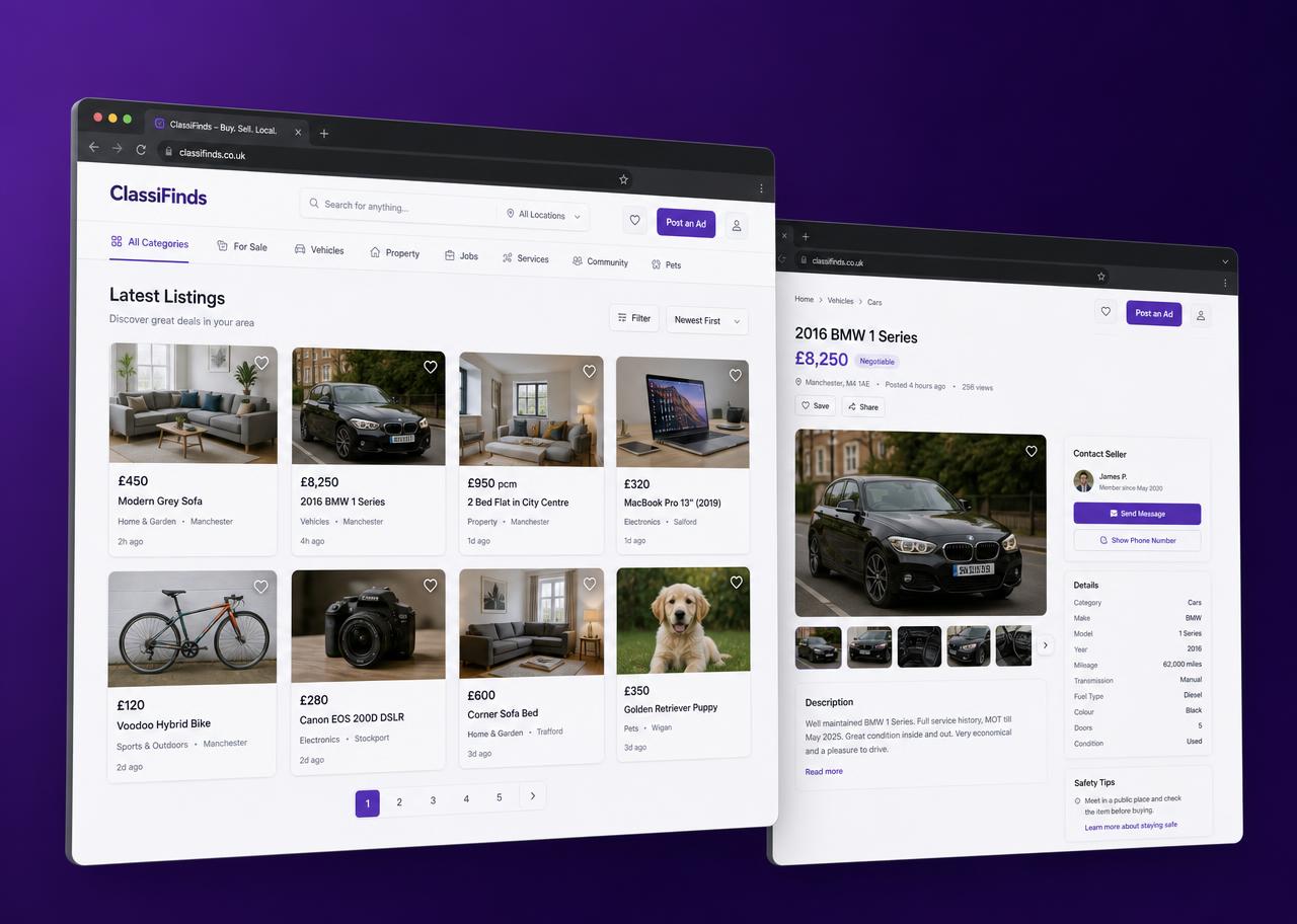
Website Redesign
- Role
- Product Designer
- Tools
- Figma, Google Analytics
- Tags
- UI/UXWebMarketplaceRedesign
About
Craigslist is one of the most-used classifieds platforms on the web — millions of people rely on it every day to find work, housing and second-hand goods. Its interface, though, has barely changed since launch: unstyled blue links, no imagery and very little hierarchy.
This self-directed redesign keeps the density and speed people depend on, but rebuilds the visual system around a modern classifieds structure — so listings can be scanned, compared and acted on without losing the plain-spoken character of the original.

Creative Process
- 01Problem Statements
- 02Research
- 03Wireframing
- 04Visual Design
Problem Statement
- No visual hierarchy
- Cluttered layout
- Clumsy navigation
- Outdated visual design

Goals
- Improve site navigation
- Upgrade the visual design
- Ensure visibility of all pages
- Facilitate the landing page

Research
Research ran on two tracks. Google Analytics gave the behavioural picture — which categories carry traffic, where sessions end, how deep people go before bouncing. Surveys and short interviews explained the why behind those numbers.

Competitor Analysis
Three platforms solving adjacent problems were reviewed for how they structure listings, filters and detail pages — two job marketplaces and one high-density classifieds site.

Upwork
Strong filtering and a job card that leads with pay, location and fit.
Familiar three-pane browse: filters, results list, detail — no page reload.
Jumia
Dense category grid that still scans well because of image-led cards.
Key Takeaways
- — Image-led cards make dense grids scannable without cutting information.
- — Filters belong beside results, persistent and always visible.
- — A detail page should never lose the user's place in the list.
Wireframing
Low-fidelity sketches worked through the browse → filter → detail path before any styling decisions were made.
Layout
- Total Columns
- 12
- Column Width
- 80px
- Gutter Width
- 24px
Color Palette
#6A2985
Plum primary
#EFE0F5
Lavender tint
#000000
Ink / body copy
#FFFFFF
Surface white
#F7F7F7
Neutral grey
Redesigned Screens
Old Design
Location Page | Job-Type Page | Job Details Page
Problems
- — Every link carries the same weight, so nothing reads as primary.
- — Filters are scattered across the page instead of grouped.
- — No imagery, so listings can't be compared at a glance.
- — Users lose their place when opening a listing.
New Design
Location Page | Job-Type Page | Job Details Page
Guidelines
- — One plum header bar anchors navigation on every page.
- — Persistent left filter rail; results update in place.
- — Image-led listing cards with price, place and posted date.
- — Detail view opens beside the list, not away from it.
Constraints, Limitations & Future Considerations
This was a self-directed redesign, so there was no access to Craigslist's real traffic data, moderation rules or the regional variations that shape the live product. The work was scoped to the job-search path rather than the full marketplace.
Next steps would be usability testing on the new browse flow, a mobile-first pass on the listing detail page, and a look at how the posting flow could carry the same clarity.